Instagram Reel Size, Dimensions, and Specs Guide for 2026
Key Takeaways
- •1080 by 1920 at 9:16 is the specification, and exporting larger gains nothing because it is downscaled
- •Keep essential text out of the bottom quarter, top eighth and right edge, where interface elements sit on top
- •Reels crop to a centre square in your profile grid, so covers with text near the top or bottom get cut off
- •Quality loss usually comes from uploading on a weak connection, the high quality setting being off, or re-encoding an already compressed file
- •Build a template with guide rectangles once, and the entire category of problem disappears permanently
Getting Reel dimensions wrong costs you in two ways that are easy to miss: content gets cropped in places you did not check, and text lands under interface elements where nobody can read it.
Both are avoidable with a template and five minutes of setup.
The specifications
Aspect ratio: 9:16, vertical.
Resolution: 1080 by 1920 pixels. Higher resolutions are downscaled, so there is no benefit to exporting larger, and compression is generally kinder to a clean 1080 by 1920 than to an oversized file.
Frame rate: 30 frames per second is standard. Higher rates are accepted and get compressed.
Format: MP4, H.264 video with AAC audio, which is what every editor exports by default.
Length: up to three minutes. The optimal length depends entirely on the content, and shorter clips that get rewatched frequently outperform longer ones on distribution.
Cover image: 1080 by 1920, and it also appears cropped to a square in your profile grid, which matters below.
The safe zone, which is what people get wrong
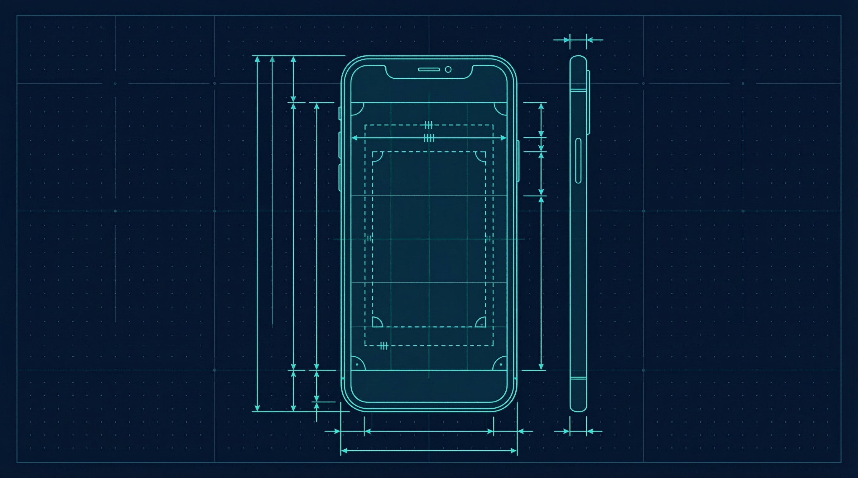
The full 1080 by 1920 frame is not all visible in every context. Interface elements sit on top of it.
Reserve roughly the bottom quarter of the frame. The caption, the account name, the audio label and the action buttons all sit there. Text placed in this area is covered.
Reserve roughly the top eighth. The status bar and, in some contexts, additional interface sits here.
Reserve the right edge, where the like, comment, share and save buttons sit vertically.
Practical safe zone: keep all essential text and any important part of the image within the central area, avoiding roughly the bottom quarter, the top eighth and a strip down the right side.
The failure people discover after posting is text placed near the bottom that is perfectly visible in their editor and completely covered in the app.
The grid crop problem
Reels appear in your profile grid, and the grid crops to a square from the centre of the frame.
Which means:
- A cover image with text near the top or bottom will be cut off in your profile.
- The visual subject should be roughly centred if you want the grid to look coherent.
If your profile grid matters to you aesthetically, design covers so the important part survives a centre square crop.
Text and captions
- Large enough to read at phone size, which is smaller than it looks on a desktop editor. When in doubt, larger.
- High contrast against the background, including when the background changes mid-clip.
- Captions for speech, since most viewing is silent. Auto-captions are available in-app and are worth checking for errors before posting, because names and technical terms are frequently wrong.
- Keep captions out of the bottom quarter, which is the most common placement mistake because auto-generated captions often default there.
Exporting from common tools
CapCut: set the canvas to 9:16 and export at 1080p. The default preset is already correct.
Premiere or Final Cut: create a 1080 by 1920 sequence, export H.264 at 1080p.
Canva: the Instagram Reel preset is 1080 by 1920.
Phone camera: already vertical, though check the resolution setting since some phones default to 4K, which produces unnecessarily large files that get compressed anyway.
Quality problems and how to avoid them
Reels frequently look worse after uploading, and the causes are consistent:
- Uploading over a weak connection, which triggers a lower quality processing path. Upload on wifi.
- Turning off the high quality upload setting, which exists in the app's settings and is worth enabling.
- Re-encoding repeatedly. Editing an already-compressed export and exporting again compounds quality loss. Edit from source footage.
- Very high bitrate exports, which get compressed hard anyway. A reasonable bitrate at 1080p usually looks better than an enormous file.
- Watermarks from other apps, which are not a quality problem but do cause the post to be discounted in distribution.
Practical setup
Build a template once, in whatever tool you use:
1. Canvas 1080 by 1920.
2. Guide rectangles marking the bottom quarter, top eighth and right strip.
3. A centre square guide showing the grid crop.
4. A text style at a size you have verified is readable on a phone.
Then check every export against it. This takes an afternoon and prevents the entire category of problem permanently.
Length, honestly
There is no correct length. What matters:
- The first second decides distribution, regardless of total length.
- Completion rate matters, so a shorter video that is watched fully beats a longer one that is abandoned.
- Rewatches count, which is why very short clips containing a lot can perform disproportionately well.
- Longer content works when it holds attention, and fails badly when it does not.
Make it as long as the content needs and not longer, then cut every pause.
For the wider strategy, how to use Instagram covers which formats do which job, and how to add music to Instagram posts covers the audio side, including why the music option is sometimes missing.
Written by Nina Kowalski
Nina is an educator and course creator who has generated over $2M in online course revenue.